Glossi
A digital publishing platform for users to create and share their own digital magazines.
Project Type Social platform / authoring tool
Timeline 2011 - 2014
Users fashion influencers, media fandoms, classrooms
Involvement Product management, research, testing, wireframes, interaction design, front-end prototypes
The Problem: Usability
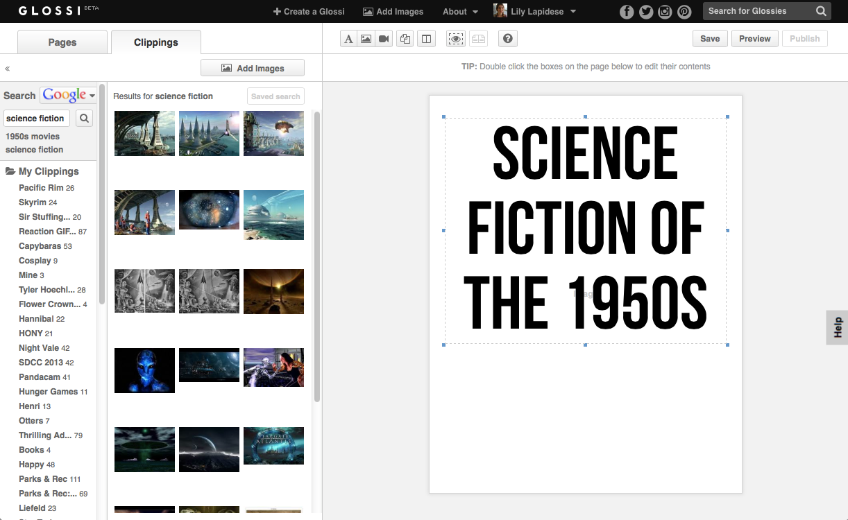
The core of the product was the Glossi editor, a WYSIWYG interface for the creation of Glossies, intended for ease of use regardless of technical or design proficiency. Unfortunately, it tended to confuse and frustrate users more often than not.
The Process
I fought for – and ended up leading – two rounds of extensive user testing through remote usability video tests and quantitative surveys.
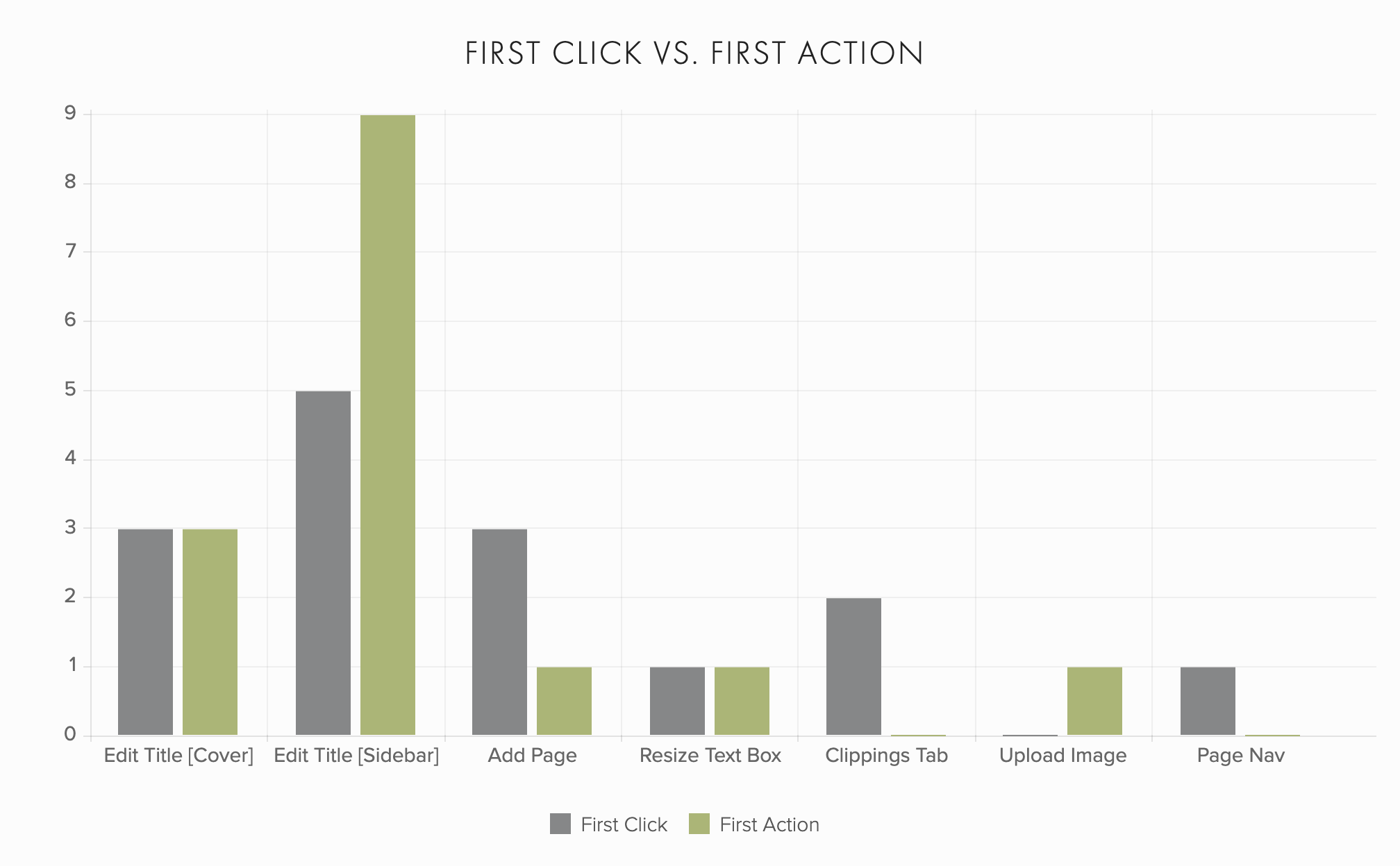
After the first round of testing, I assessed problem areas and proposed dozens of changes to be implemented by both myself and the development team. This led to massive usability improvements as evidenced by the second testing round.
The Results
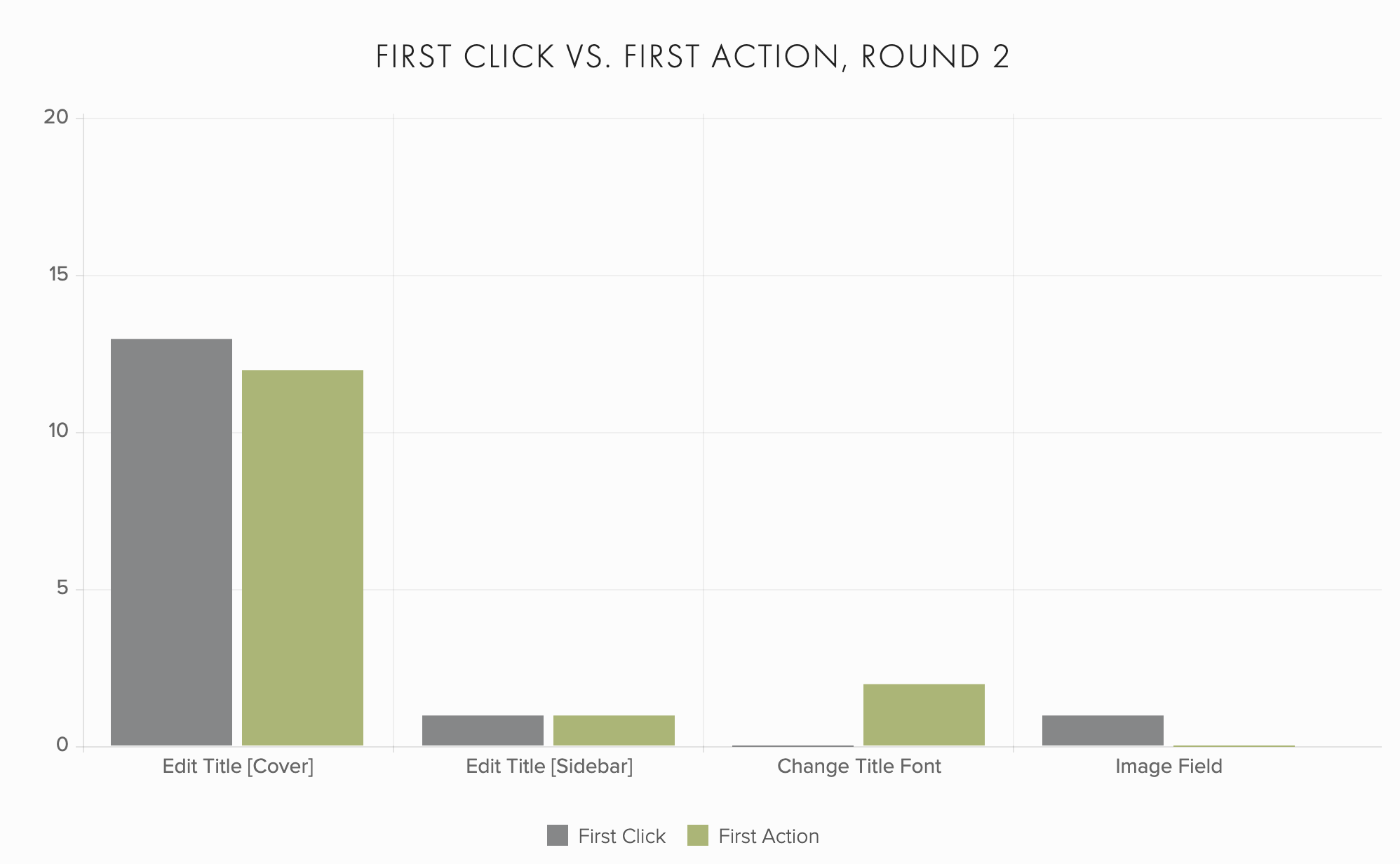
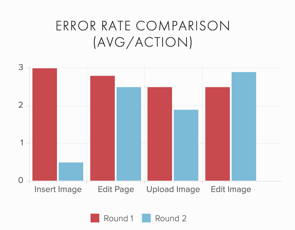
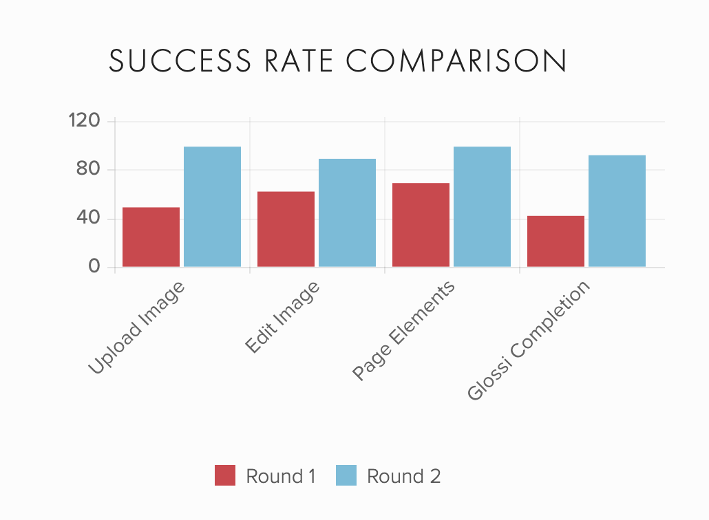
Thanks to the results from round one, we were able to make extremely effective improvements throughout the editor. The first click and first actions became far more consistent across the board. With that immediate call to action upon page landing, we all but eradicated that initial moment of confusion. For individual actions, error rates decreased and success rates increased. Finally, and most importantly, overall editor success shot up from 43% in the first round to 93% in the second.
The Problem: Conversion
After a user signed up for digital magazine creator Glossi, they were dropped directly into the editor to create their first magazine. Unfortunately, even after making improvements to the editor’s usability, we were still seeing a high number of inactive accounts and a low number of Glossies completed in that initial flow.
The new goal: decrease the drop-off rate of new users. Success would be determined by the percentage of Glossies published by users who have just created an account.
The Process
Market Research & Competitive Analysis
I researched how other apps had constructed introductions and on-boarding flows for their new users, examining the intentions behind their processes and utilizing the patterns that emerged.
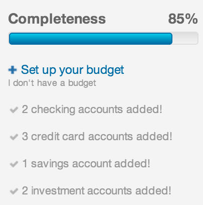
Pattern 1: Completion Incentive
Value is gained by indicating to a user their step-by-step movement through a process:
- Gives the user a sense of accomplishment as every action on the list is completed.
- Instills a desire to engage more in order to bring the process to completion.
- Includes assurance of progress as well, letting the user know they’re on the right path.
- Plays into the emotional and psychological reward of finishing, resulting in catharsis and a sense of accomplishment. See also: game theory and gamification, specifically the emotion fiero and completionist psychology
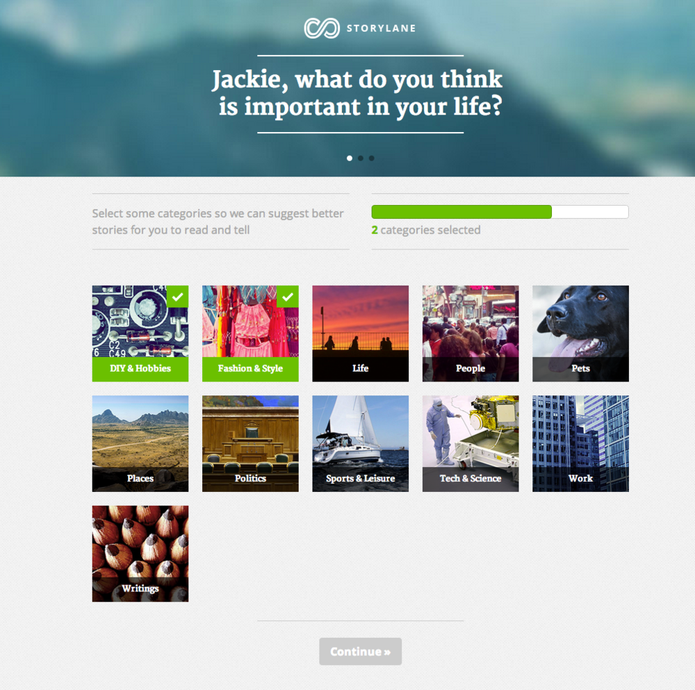
Pattern 2: Reduce Destractions to Ease Decision-Making
Filling up the whole page (versus a smaller modal window) and using large, attractive images and text catches attention and reduces distractions.
- Use of fill in the blank text fields and multiple choice lists to guide the user through a few simple decisions that automatically customize their experience.
- Natural, friendly language in copy and forms to make it fun and put the user at ease.
- Don't drop the user into a new area with no direction - provide a clear first step that will lead naturally to another step in the intended flow.
Onboarding Flow Redesign
Drawing inspiration from the usability test results and competitive analysis, I outlined a few primary goals of the new design:
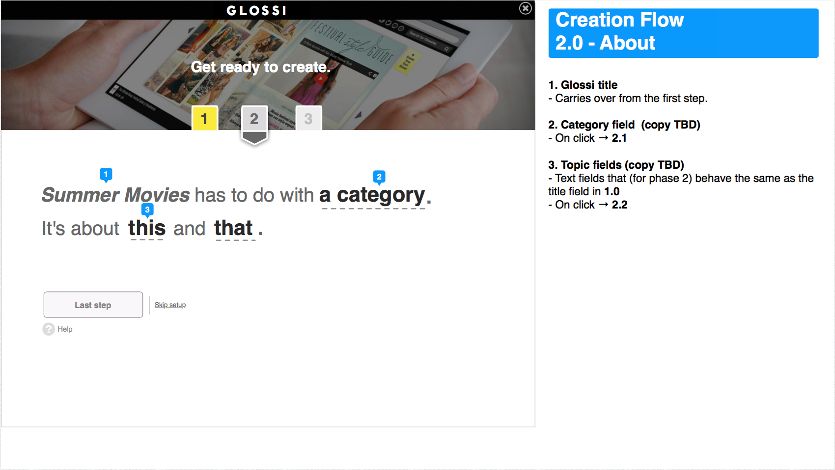
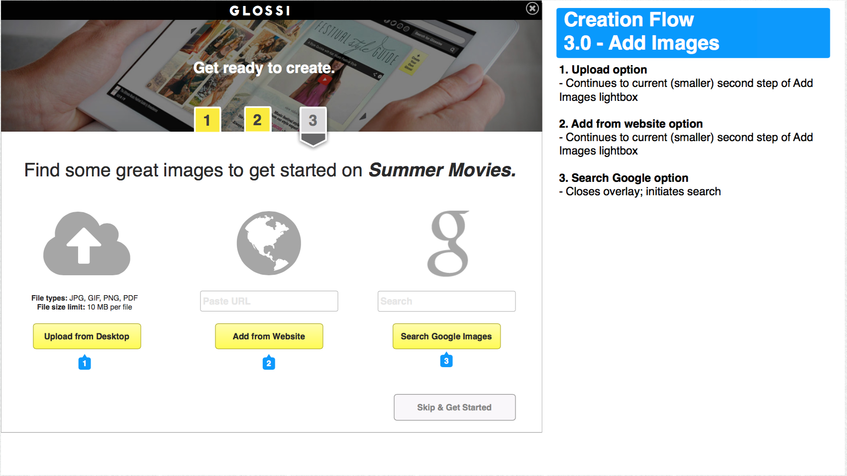
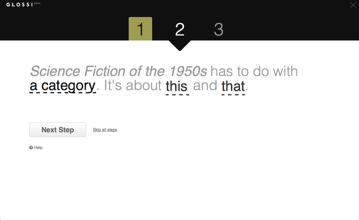
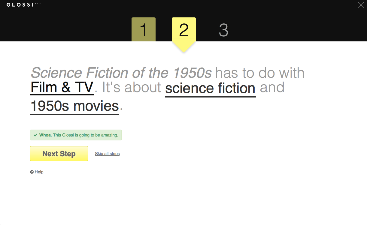
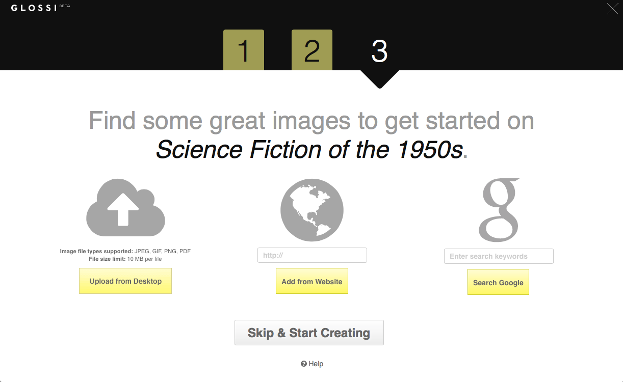
- Split tasks into sequence of chunks (groups of operations, specific decision points)
- Each task dealt with in a discrete mental space
- Establish trust with visual & textual reassurance after each click
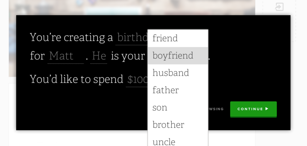
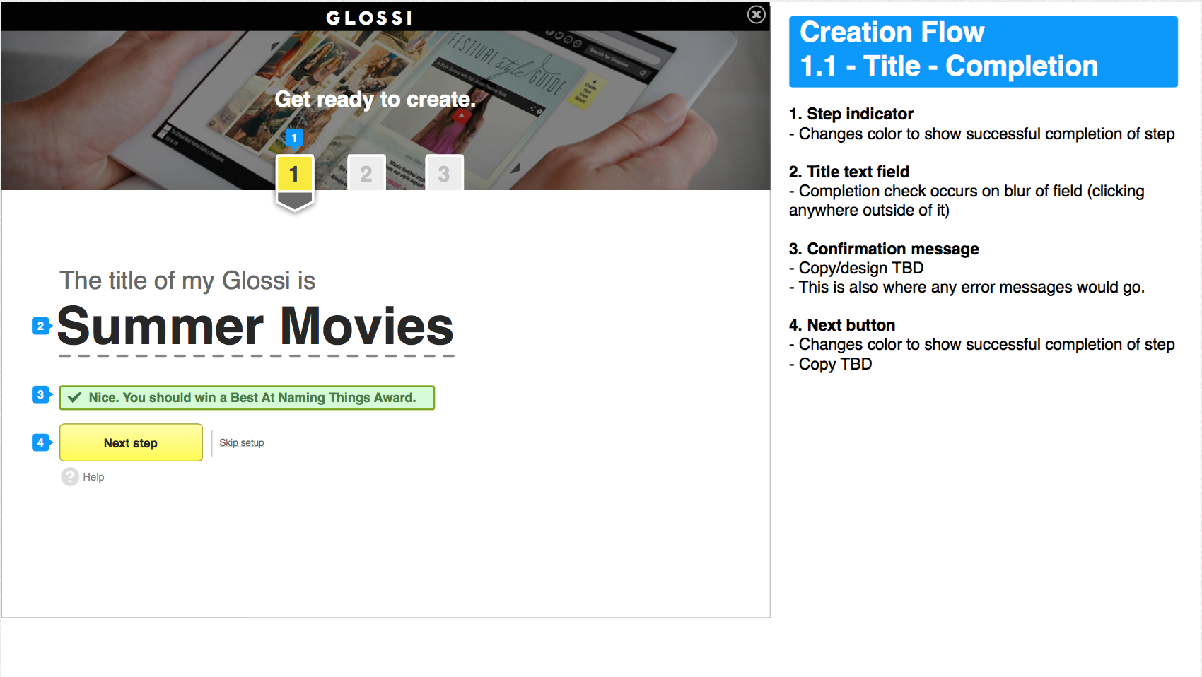
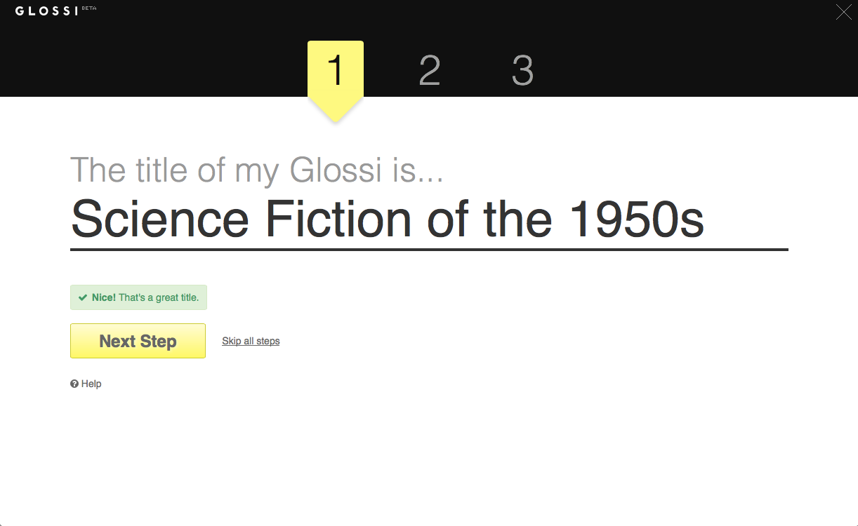
- Prompt for title first to help user focus on what it is they want to make, then pre-populate relevant content so they get invested right away
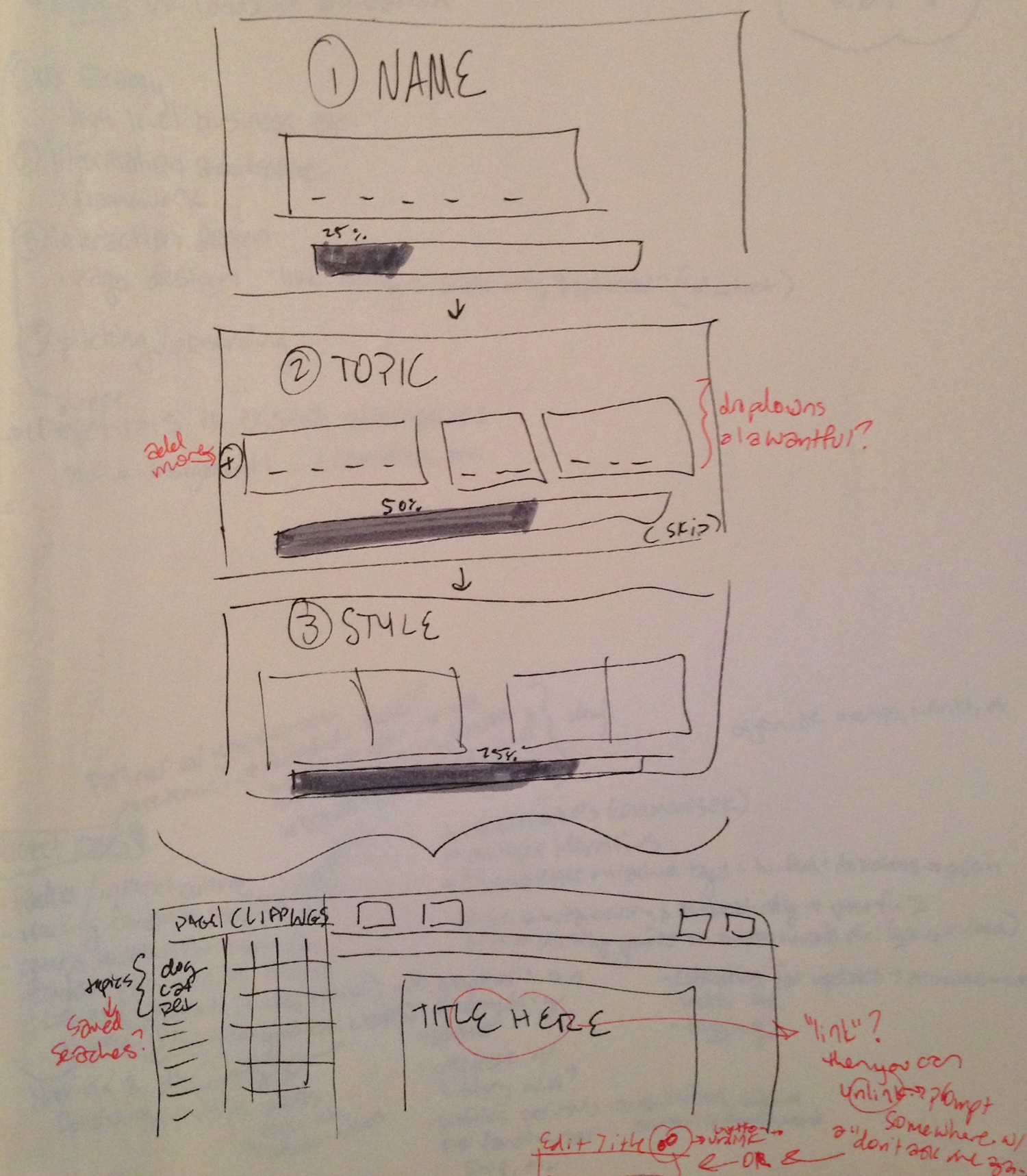
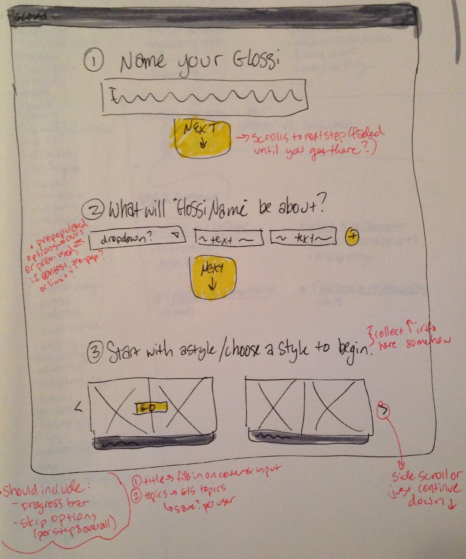
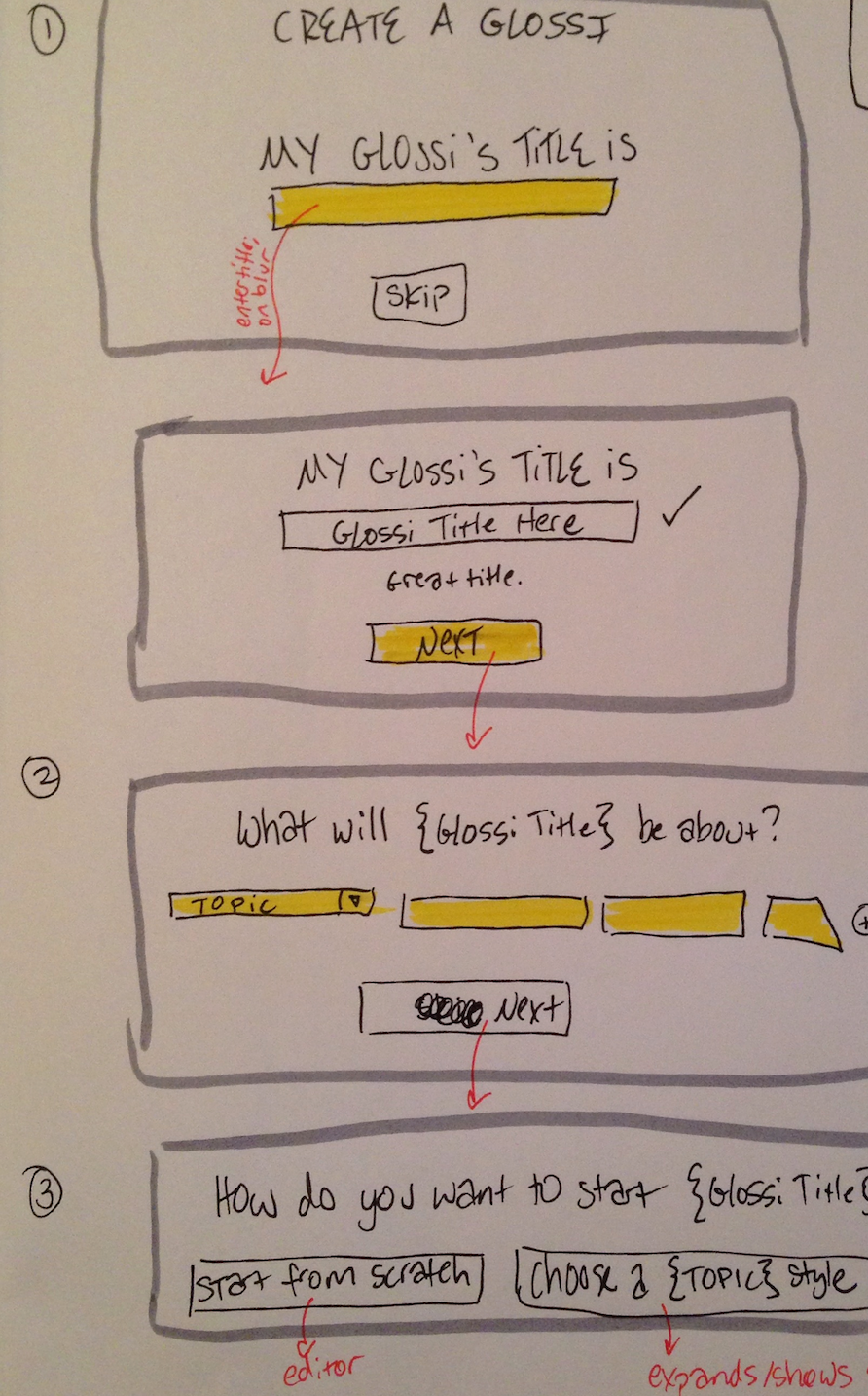
Sketches and Wireframes
I rapidly iterated on early concepts through sketches, then evolved those into annotated wireframes.
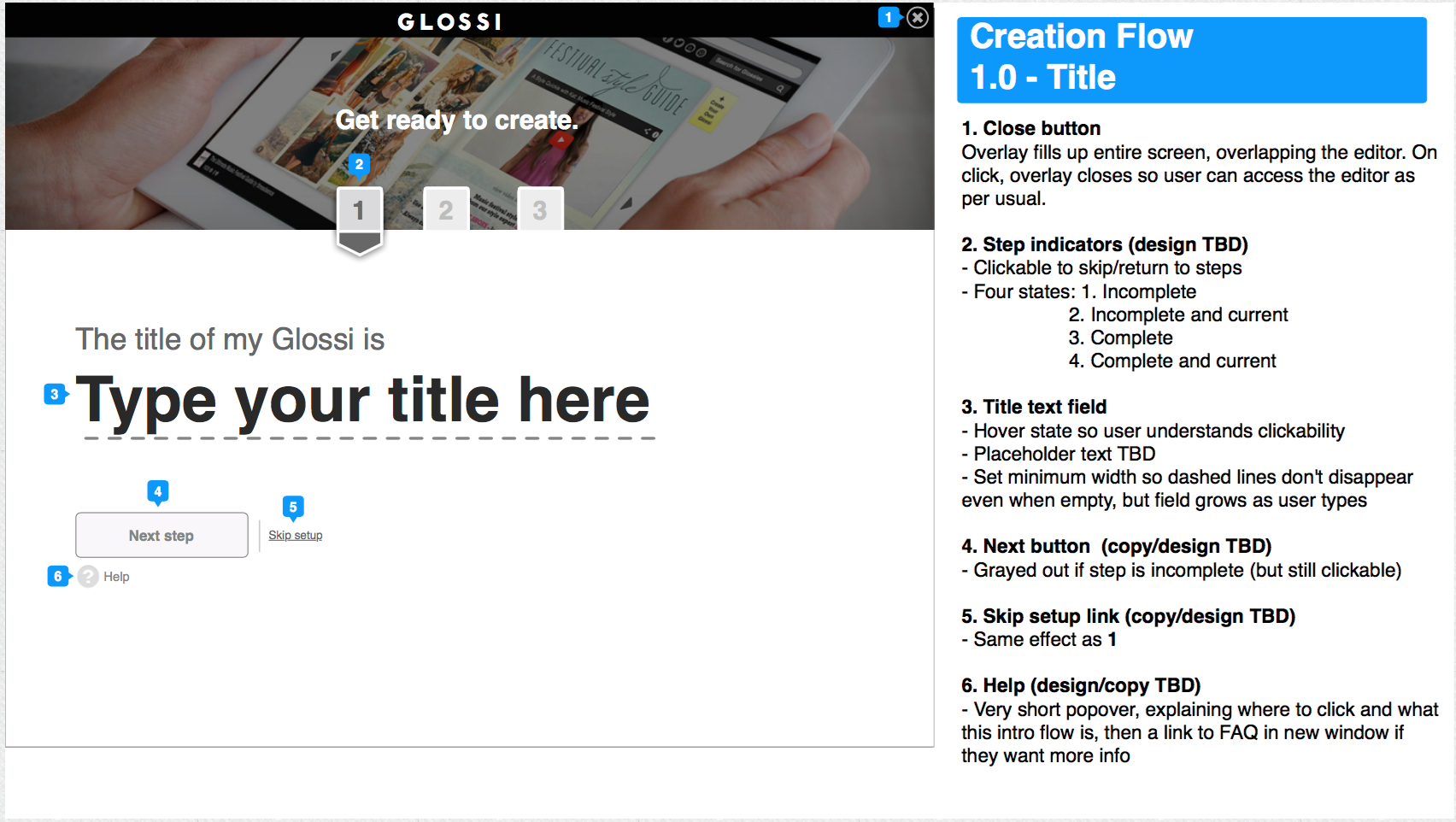
Prototypes
I refined the wireframes into polished visual designs, and coded the front-end for production implementation.
Results
I ran a multivariate test comparing two new onboarding funnels, measuring how many users were successfully converted (defined as able to complete and publish their first Glossi right after account creation). I tested three variations over two weeks:
- Creation Flow: the new step-by-step process shown above
- Welcome Lightbox: a modal window with text welcoming the user to Glossi with some basic instructions
- Original: new users land directly in the editor as before
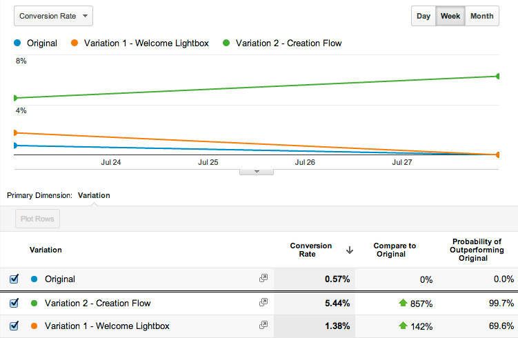
The new creation flow led to a 5.44% conversion rate, beating out the original 0.57% by a landslide. It was immediately implemented for all users.