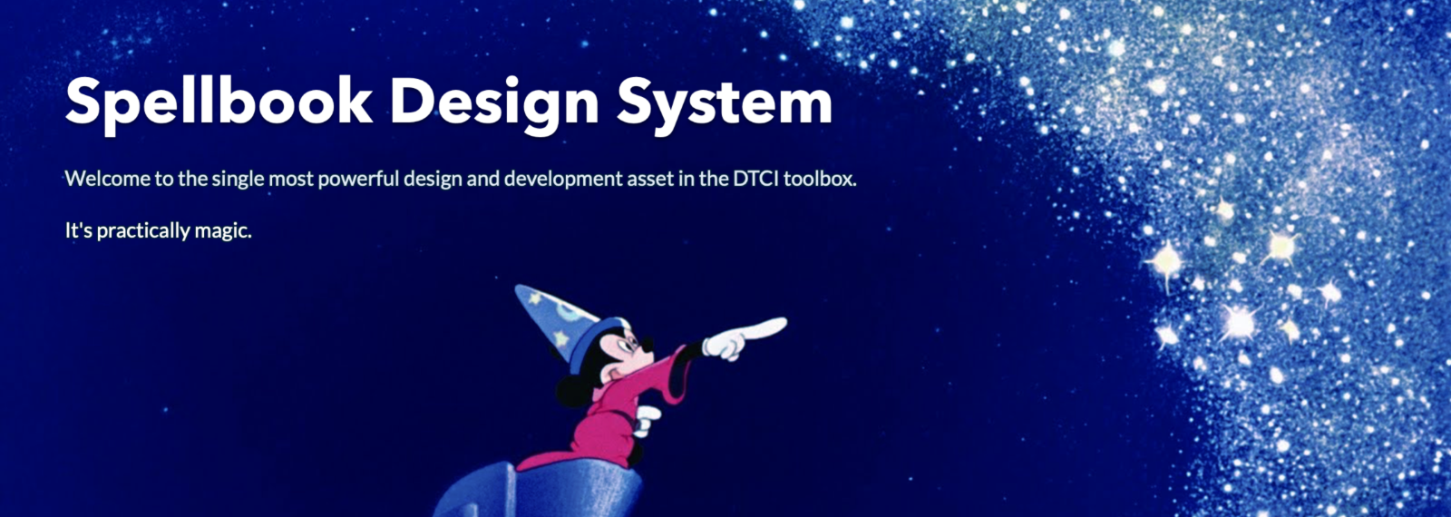
Spellbook
A living design system created to accelerate the pace of innovation and delivery at scale by bringing engineers and designers together in close collaboration.
Project Type Design System
Timeline July 2019 - July 2020
Users Disney design and engineering teams
Involvement component design, React and SCSS, documentation
The Problem
The team was facing issues handling inconsistency of design across its portfolio, plus the burden of recreating the same basic elements over and over again. Visual design direction consistently got lost or changed on its way to implementation. We had tried static style guides in the past but they’d proven difficult to maintain over a longer period of time, and still were resulting in a lot of re-work.
The Process
Kickoff
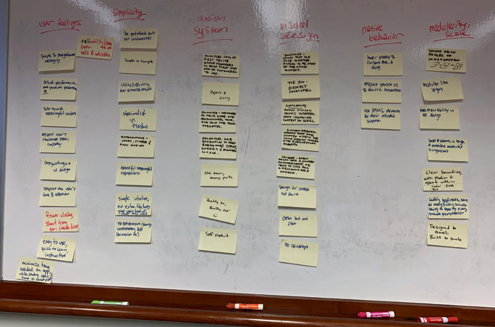
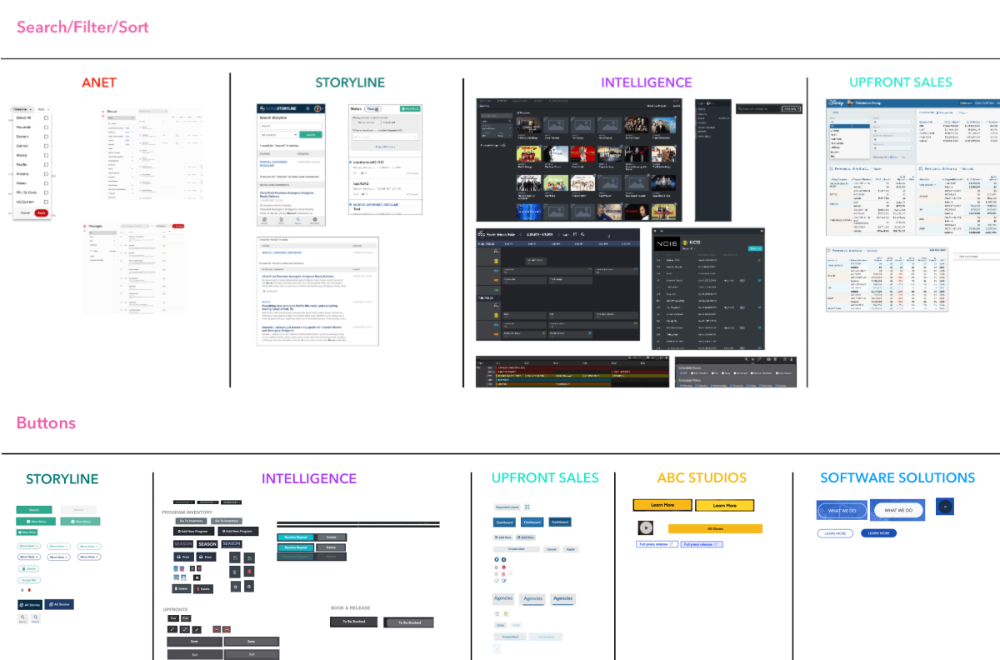
I learned about how powerful design systems can be when I was fortunate enough to attend An Event Apart in Orlando. Excited about the potential, I gave a presentation upon my return, introducing the design system concept to the entire team. I came together with those who were equally interested to begin discussions on what our system should be. I ran a workshop with the designers and UI engineers to collaboratively come up with our guiding principles for the system. I led an audit of our existing projects, compiling visual documentation of our most common design patterns to inform component prioritization.
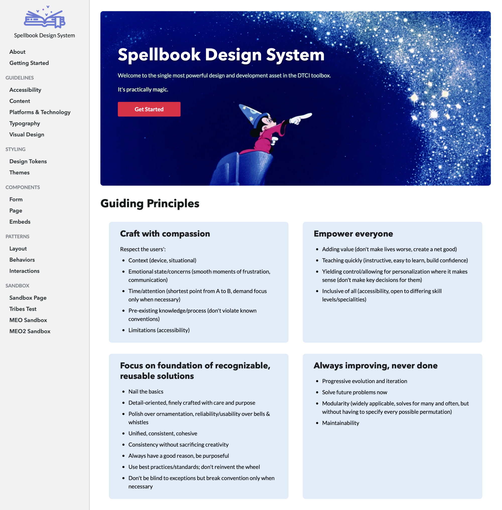
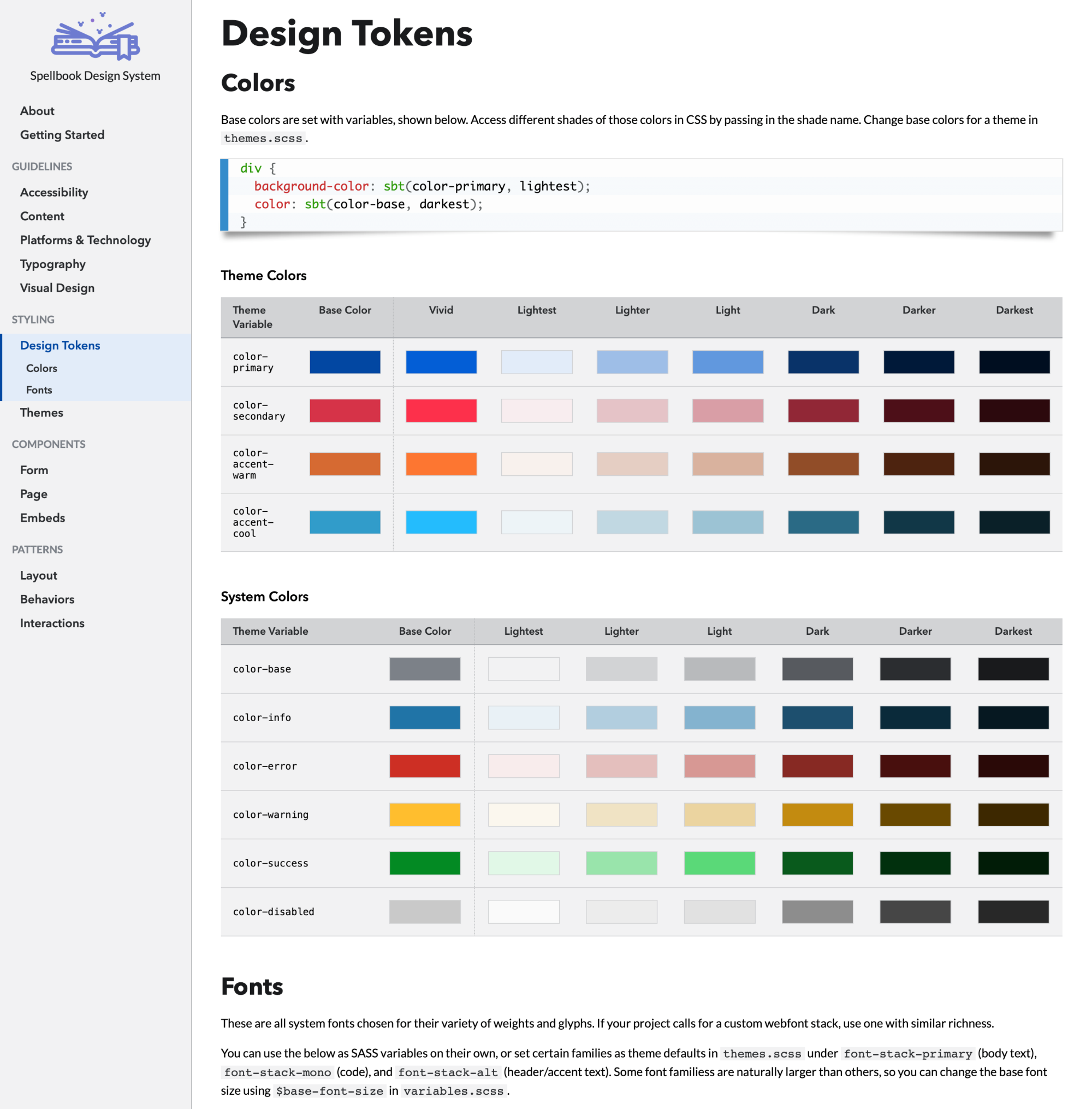
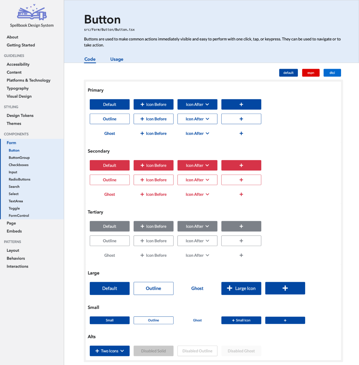
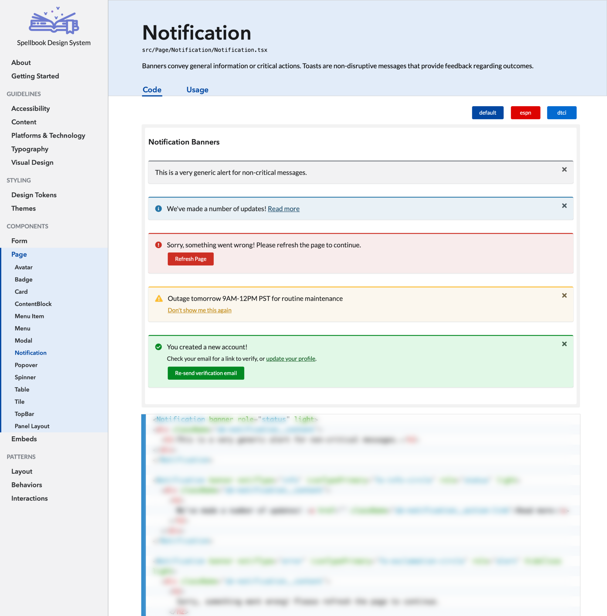
We determined that we would be creating a design system with components in code, all styling built into the component itself, with standards and guidelines for usage as a critical part of each component.
Development
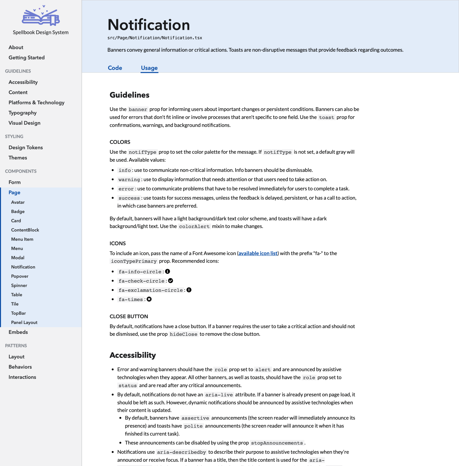
We found ourselves in a position where we had to produce something in order to get full buy-in from management, and thus didn't have many resources to fully dedicate. The team who ended up leading the charge (me and two UI engineers) was small, scrappy, and determined. Over the course of a few months, we worked closely for the initial development of the design system. I was a direct contributor to the Github repo, designed all of our existing components as well as the system itself, wrote all the Sass styling for the project, and learned React/TypeScript to create new components. I assembled usage documentation for each component as well, with a focus on accessibility and helpful guidelines for both engineers and designers.
The Results
Even in such an early stage of its development, Spellbook has already proven itself out to be a valuable part of the team's process. Thanks to the built-in components and styling, engineers on one newer project were able to spin up a viable first iteration with minimal design oversight in just one sprint.